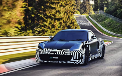
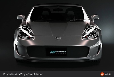
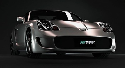
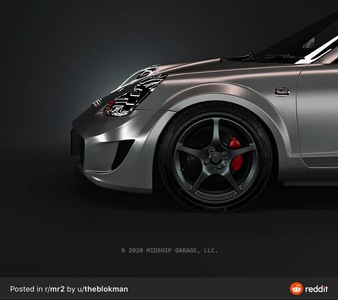
The side profile isn't very good but the overall front design is pretty nice. More modern than the 2000 bumper. Although I am always wary of the final implementation of Midship Garage products.
2000 Toyota MR2 Spyder, 2021 Lexus UX 250h F Sport
The side profile isn't very good but the overall front design is pretty nice. More modern than the 2000 bumper. Although I am always wary of the final implementation of Midship Garage products.
I agree. Overall I’m not crazy about it, but this is the finest looking aftermarket bumper I’ve seen.
Here are more pics. I assume the side skirts and rear fascia are awaiting a similar dramatic release.
2003 Black/black 5-speed MR-S
Yeah I don't like that sharp crease in the side. However I DO need a new front bumper, mine is broken.
2000 Toyota MR2 Spyder, 2021 Lexus UX 250h F Sport
I don't hate it but I want to see more photos of it and possibly someone else take the leap and get one first so we get a review of the quality, fit and finish.
First time seeing it, I kind of like the updated look without being over done.
On one hand, I agree with Wilco. On the other hand, the pictures show me uneven gaps between the bumper and the hood, and again between the bumper and quarter panels.
I like straight lines where there should be straight lines, not wavy gaps that cheapen the entire appearance.
On the third hand, it reminds me of an S2000, which isn't necessarily a bad thing.
http://zero3nine.com/files/dospwn.gif
I like it because it’s subtle and not in your face crazy like you added a body kit and orange wheels.
However the first photo is stupid beyond comprehension with trying to digitize the body like a prototype for the press.
I like it but wish they had shown the side view without the crazy zebra strips.
😐 I'll keep mine...
Mono Craft GT-300 with a few upgrades...
i'm gonna be opinionated and maybe in the minority here:
i hate the front bumper. i just hate it so much.
on a celica from the same year? sure. shape matches.
on an mr2 spyder with the headlight shape we have? big fuckin' no.
if they sold it as a front end conversion for celica front lights, it might look decent, but it looks like they watched too much sketchmonkey (whose re-draws i also find terribly lacking).
So now i see a jaguar f-type bumper that looks like it's been photoshopped on with the center opening WAY wider than it should be, and an awkward blend from fender to bumper. (i also don't like jaguar's front bumper openings).
it's an effort i guess, but not a good effort, in my view.
03 spyder
Yeah.... the more I look at it, the more I think that front hole is way too big.
http://zero3nine.com/files/dospwn.gif
I like it from the front, but the side profile bothers me. Too many sharp edges whereas the rest of the body has soft edges.
Yeah... it's not the worst one I've seen. But I just don't like it enough to replace my stock bumper with TRD lip. Once I've finished the engine side of things with my car, I will be looking more towards the exterior though. Maybe Phattires will be looking to offload one of his many widebodies by then. hahaha.
Get your Short Antennas, Decals, and all sorts of goodies at:
https://takubanmotorsports.com
I kinda like where they were trying to go, but the fender flares are too Cadillac-chiseled, and that is a look I really dislike. Doesn't harmonize with curves in any case, and certainly not so close together.
I do like the corner vents. Not seeing a problem with the larger mouth.
Overall look is neo-angry-fish, a fad that needs to end soon as well, but this is not too angry, nor fishy. Post-neo-angry-fish, perhaps.
But, what pwnzor said. Bad fit = no deal no matter how pretty one might think it is.
🐸, 2003, Electric Green Mica
I like it, but it’s not clear how to make it work with a post-facelift Spyder. You would either have to move the side indicators or eliminate them and the fog lights.
